Page 1: Responsive Web Page Tutorial, HTML/CSS Only
Page 2: Page Structure using Flexbox and a Media Query
Page 3: Footer (nested flexboxes)
Page 4: Header (menu/search toggles, transition effects)
Page 5: Sticky Aside
Page 6: Make it Beautiful
Page 7: JavaScript Efficiencies, Breadcrumbs, Cats, Audio and More
Page 8: Embedded Note from Creator and Floating Hearts
Page 9: Move On To, Video Tutorial
Make It Beautiful
I know what I like when I see it. However, I don't have the artistic skills needed to create a beautiful web page. Many years ago, I purchased a responsive web page template (called ‘Pen & Paper’) by Dabaman, for use as my homepage. When I was ready to make my math lessons responsive and beautiful, I returned to Dabaman to help me replicate the ‘look-and-feel’ of my beloved ‘Pen & Paper’ design. Any beauty you find in the final responsive web page design should be credited to Dabaman! (Dabaman is currently at Envato Studios, but they're closing in late August 2022.)
CSS Units to Specify Length
Length/distance units can be absolute or relative.
Absolute units, like inch (in) or centimeter (cm), indicate a fixed length.
Relative units (like em and rem )
are calculated relative to something else.
Don't use absolute units in responsive web page design.
The interpretation of absolute units (like 1in or 1cm )
by browsers/monitors/devices is varied and vague.
Users may not be able to influence absolute units, potentially leaving them unable to make a page element larger or smaller.
For responsive web design, instead use relative units, preferably the rem :
-
em:
Traditionally, the length unit ‘em’ was defined as the width of the capital letter ‘M’ in the current typeface and point size. In CSS,emis a relative length unit that is relative to the size of the parent. For example,1.5emmeans ‘1.5 times the size of my parent’. Parents can change as code is changed, so using the relative length unitemcan be hard to maintain. -
rem:
The CSS unitremstands for ‘root em’, and is a relative length unit relative to the root element size. The default HTML root element size is16px. Using this default,1.5remwould result in a computed value of24px, since $\,(1.5)(16) = 24\,.$
In the following tables, all squares have sides of either 16px, 1em, or 1rem, as indicated:
| This table has the default font-size (16px). | ||
|
16px |
1em |
1rem |
| All squares should have the same size. | ||
This table has: font-size:x-large; |
||
|
16px |
1em |
1rem |
The em square is bigger,since its parent got bigger. |
||
We'll primarily use units of rem .
(Media queries will remain in terms of pixels.)
The prior CSS code will be adjusted as final styling is applied.
Backgrounds/Colors/Opacity
-
Remove prior background colors:
Remove all background colors in the prior CSS code—these temporary colors merely helped to reveal the page structure. -
Background texture:
The responsive page uses a subtle paper-grain background image. To download the
furley_bg.pngfile (‘bg’ for ‘backgground) that I use (size 42kB), click here.Put this code (with your own URL, of course) in the CSS for
body:background: url(/graphics/furley_bg.png);By default, the image is repeated both vertically and horizontally, and scrolls with the page. The leading forward slash ‘/’ in the URL indicates that the path starts at the root directory.
-
‘Soften’ header and footer:
The responsive web page header and footer should be differentiated slightly from the rest of the page.Put this code in the CSS for
header:background-color: rgba(255,255,255,0.75);Put this code in the CSS for
footer:background-color: rgba(255,255,255,0.5);Keep reading for a discussion of this code.
-
rgba(red,green,blue,opacity):
The
rgba(red,green,blue,opacity)function expresses a color according to its red, green, and blue components, with an optional opacity. Red, green and blue can take on integer values in the interval $\,[0,255]\,.$ Here are some(r,g,b)illustrations of background colors with equal amounts of red, green and blue:
Notice that(0,0,0) (64,64,64) (128,128,128) (192,192,192) (255,255,255) rgb(255,255,255)is pure white. -
Opacity:
Opacity takes values in the interval $\,[0,1]\,,$ and specifies the degree to which content behind/under the styled element is hidden:
opacity:0;Underlying content is 0% hidden; i.e., not hidden at all (totally visible).opacity:0.5;Underlying content is 50% hidden.-
opacity:1;Underlying content is 100% hidden; i.e., totally hidden (invisible); this is the default value.
In the following table, the furley background texture is applied to the entire first row. This background texture becomes the underlying element for the first row. Increases to the opacity specified in
rgba(r,g,b,opacity)will increasingly hide this background texture, thus allowing thergb(255,255,255)background color to shine through:text text text text text (255,255,255,0) (255,255,255,0.25) (255,255,255,0.5) (255,255,255,0.75) (255,255,255,1) bg 0% hidden;
bg totally visible( footervalue)( headervalue)bg 100% hidden;
bg invisibleWe're ‘softening’ the background texture by allowing white light to ‘shine through’ it. Notice that the responsive web page
headeris a little ‘brighter’ than thefooter.
Fonts
-
Curly quotes:
Curly quotes (‘single’ and “double”) are important for my lessons; all my font options (below) have good-looking curly quotes.
-
font-family:
Put this code in the CSS for
body, thus specifying the default document font:font-family: Georgia, "Times New Roman", Times, serif;The CSS
font-familylists specific/generic fonts; browsers select the first font that can be used.Here are the four specified fonts, together with text as it appears within MathJax. (These fonts may not all be available on your device, hence some may render as identical fonts.)
The quick brown fox jumps over the lazy dog
‘single’ “double”
0123456789 (Georgia)
The quick brown fox jumps over the lazy dog
‘single’ “double”
0123456789 (Times New Roman)
The quick brown fox jumps over the lazy dog
‘single’ “double”
0123456789 (Times)
The quick brown fox jumps over the lazy dog
‘single’ “double”
0123456789 (serif)
$$\begin{gather} \text{The quick brown fox jumps over the lazy dog}\cr \text{‘single’ “double”}\cr \text{(text inside math)}\cr 0123456789 \end{gather} $$Georgiais similar to the Times fonts, but slightly larger. It was designed to appear elegant but legible when printed small or on low-resolution screens."Times New Roman"andTimesare very similar. Times New Roman is ever-so-slightly simpler (look, for example, at the digit ‘5’). -
serif:
A serif is a small line or stroke attached to the end of a larger stroke. Compare:
E E serif sans-serif
(in French, ‘sans’ means ‘without’)A font in the
seriffamily will be used if none of the earlier fonts is available. -
Google fonts:
Google fonts is a huge collection of fonts for web pages. They're free and easy to use. Our responsive page uses two Google fonts:- ‘Playfair Display’ for navigation links in the header, footer, and aside
- ‘Oranienbaum’ for titles/headers
-
How to use Google fonts:
- Browse for desired font(s) at Google fonts. Click on the first desired font.
- On the individual font page, scroll to the bottom, and make the desired selection(s). Be sure to ‘add’ the desired style(s).
- Repeat for additional fonts, as needed.
- There is a ‘Selected families’ panel on the right that automatically updates with your selections.
-
When you have all desired fonts,
make sure that the
<link>radio button is selected. Copy the required code to insert in your HTML document.
-
Add Google fonts to the responsive web page:
We'll add ‘Playfair Display’ and ‘Oranienbaum’.
Add the following lines to the
The required CSS to access these fonts is:<head></head>section. (I insert them after<title></title>.)
                        <link rel="preconnect" href="https://fonts.googleapis.com">

                        <link rel="preconnect" href="https://fonts.gstatic.com" crossorigin>

                        <link href="https://fonts.googleapis.com/css2?family=Oranienbaum&family=Playfair+Display&display=swap" rel="stylesheet">
                    font-family: 'Oranienbaum', serif;

font-family: 'Playfair Display', serif; -
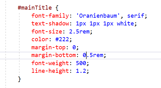
Apply Oranienbaum:
Insert a main title, as content, at the top of the
<main></main>section:<h1 id="mainTitle">Main Title</h1>Here is the corresponding CSS:
The Playfair Display fonts are applied in the CSS given below.
Search Bar Styling
The Google Search Form is styled as follows.
The search box is revealed (and given a height of 4.5rem
via the toggle function)
when the search icon is clicked.
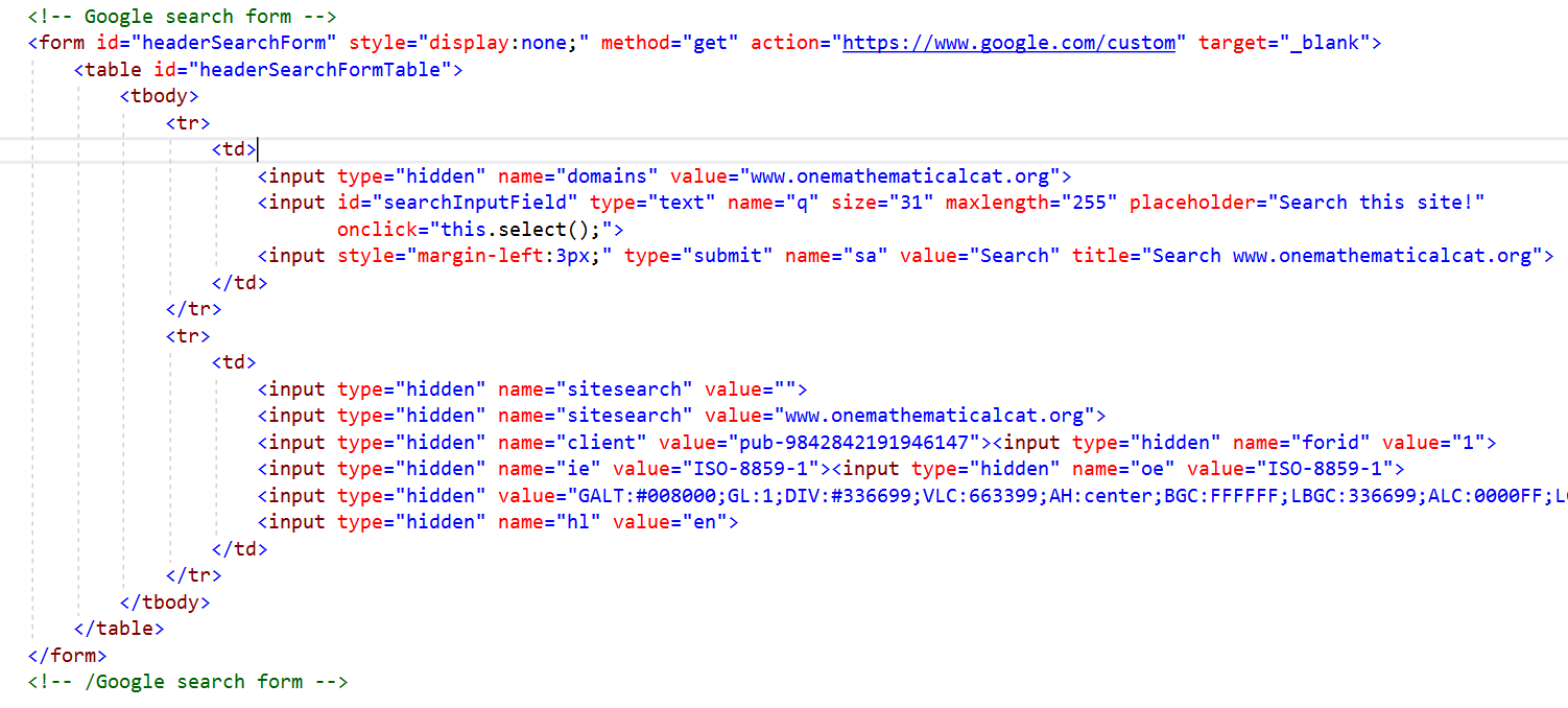 HTML code for the Google Search Form
(you can download the HTML code below)
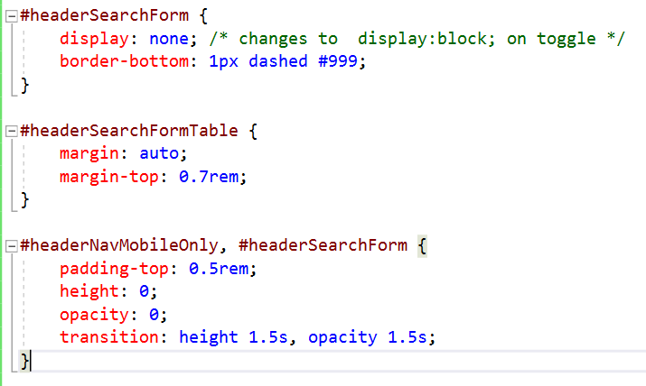 CSS Style for the Google Search Bar
(you can download the CSS external style sheet below)
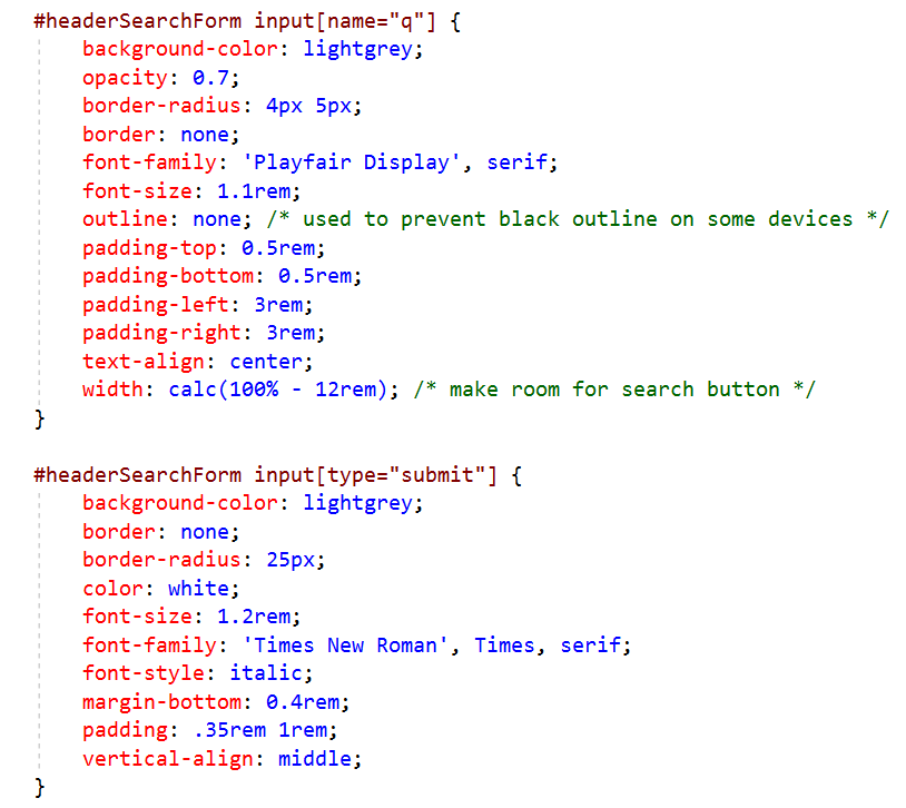 More CSS Style for the Google Search Bar
Move Style to External Style Sheet
Create an external CSS file (for me: treeOfMathLessonStyleResponsiveThruSix.css ) for
all the CSS in the head section.
Change the filename as desired, but be sure to use the ‘ .css ’ extension.
Link to the external stylesheet by putting
<link rel="stylesheet" href="/css/treeOfMathLessonStyleResponsiveThruSix.css">
in the <head></head> (with the correct URL).
(I put it after the
title container.)
Lots of Other Styling
Many more styles are applied, and some already-coded styles are tweaked, to get this styled page. With so many changes, it may be easiest for you to download the current states of the HTML file and style sheet:
Here are some notable changes/additions:
-
Change to relative units:
Pixels are changed to rems (as appropriate). -
Navigation links in
header,asideandfooter:
Playfair Display is applied; links are styled; transitions (on hover) are applied. -
Decorative borders:
Decorative borders are applied on header, footer, and the dropdown menu and search. To get correct border behavior,headerwas wrapped insideheaderContainer, andheaderNavMobileOnlywas moved insideheaderContainer. -
Fix drop-down menu behavior with an event listener:
Recall that we have:- mobile-version navigation links for small screens, accessed by the hamburger menu
- identical navigation links, spread across the top, for wider screens
Originally, I tried to fix this with a media query—but it didn't work. My genius husband figured out the problem. Clicking on the hamburger menu calls thetogglefunction, which uses JavaScript to apply the appropriate style (display:flex;versusdisplay:none;). JavaScript puts style directly on the element, just as if it were applied inline—and inline styles override any non-inline CSS. If a style is set with JavaScript, it should be changed with JavaScript.
To solve this, a JavaScript event listener is instead used. Whenever the window is resized, thecheckWindowSizefunction is called—if the new width is sufficiently large, then new style is applied (via JavaScript) to make the mobile-version links disappear. -
Turn
asideNavinto flex containers:
This gives more reliable results (and simpler code) than having lots of (say) hard-coded breaks separating the links. -
Keep main content lines from getting too wide:
It's hard to read lines that are too long/wide. So, a media query is used to keepasideMainContainerfrom getting too wide; excess space in the window appears as empty background on the right (viamargin-right:auto;). -
Fix the
visibility:hiddenbug:
When you design for the web, you must test, test, test. It was discovered that usingvisibility:hidden;(which preserves space) onheaderNavcaused the hamburger and search icons to ‘break out’ of their too-big flexbox and go off-screen on small screens. This left the user with no way to access the main menu or search form!
To fix this, the hamburger and search icons are wrapped in a new container,headerIconContainer. Then,display:none;is applied toheaderNavfor small screens, and the parent flexbox (header) now usesjustify-content:space-between;.