Page 1: Responsive Web Page Tutorial, HTML/CSS Only
Page 2: Page Structure using Flexbox and a Media Query
Page 3: Footer (nested flexboxes)
Page 4: Header (menu/search toggles, transition effects)
Page 5: Sticky Aside
Page 6: Make it Beautiful
Page 7: JavaScript Efficiencies, Breadcrumbs, Cats, Audio and More
Page 8: Embedded Note from Creator and Floating Hearts
Page 9: Move On To, Video Tutorial
Sticky Aside
A ‘sticky’ aside section for wider screens keeps the in-page
navigation links visible for users.
‘Sticky’ means that when users scroll the primary page content, the ‘sticky’ left
navigation section won't move—it ‘sticks’ to the top of the page.
For small screens, the in-page navigation section should not stick to the top: this would leave frustratingly little area beneath for the primary page content.
Default Value of: align-items
With the responsive page as we left it at the end of page 4 of this tutorial, the CSS for
the flexbox asideMainContainer looked like this:
CSS for asideMainContainer at the end of lesson 4:
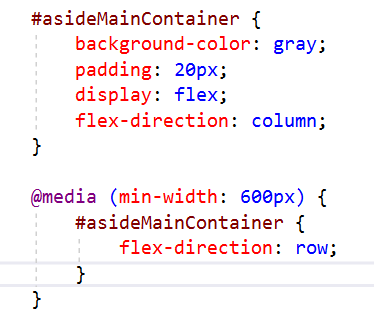
Note that align-items is not specified.
Therefore, it takes its default value of stretch.
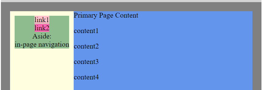
For wider screens (when the flexbox is a row),
this causes the flex-items to ‘stretch’ to fill any extra vertical space, as shown below:
Default align-items: stretch;
flex-items ‘stretch’
to fill any extra vertical space:
With this default,
our ensuing sticky efforts won't work.
Instead, the aside div (yellow background) should have the ‘natural’ height of its contents
in wider-screen mode.
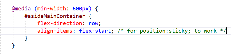
An easy way to achieve this is by adding align-items:flex-start;
to the CSS media query for asideMainContainer:
Add align-items: flex-start;
to the media query for asideMainContainer:
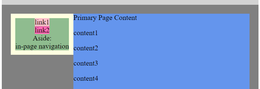
The result is:
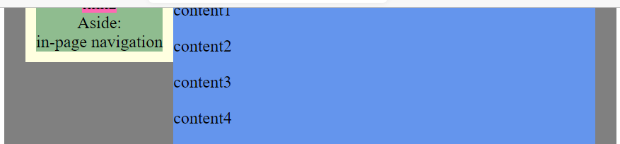
In wider mode, aside now has its natural height:
Without any ‘sticky code’ yet in place,
when the page is scrolled, the right and left columns move together.
This eventually causes the left column ( aside )
to disappear:
Start scrolling:
a non-sticky left column flows with the right column.
The left column will eventually disappear.
To make the left column sticky in wider-screen mode,
add the following media query for aside:
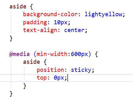
The CSS top:0; refers to the top of the viewport (0 pixels from the top).
Upon scrolling, when the top edge of aside reaches the top of the viewport,
then it will stick—it will stop moving!
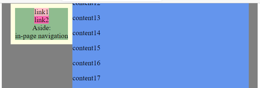
A sticky left column stays in place while the right column scrolls.
The Responsive Web Page, So Far!
Here's the responsive web page with the sticky aside added. In the next lesson, the page will start to look beautiful!