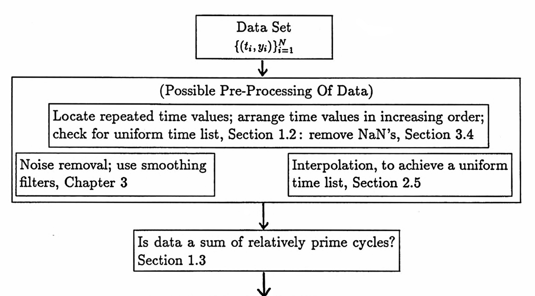
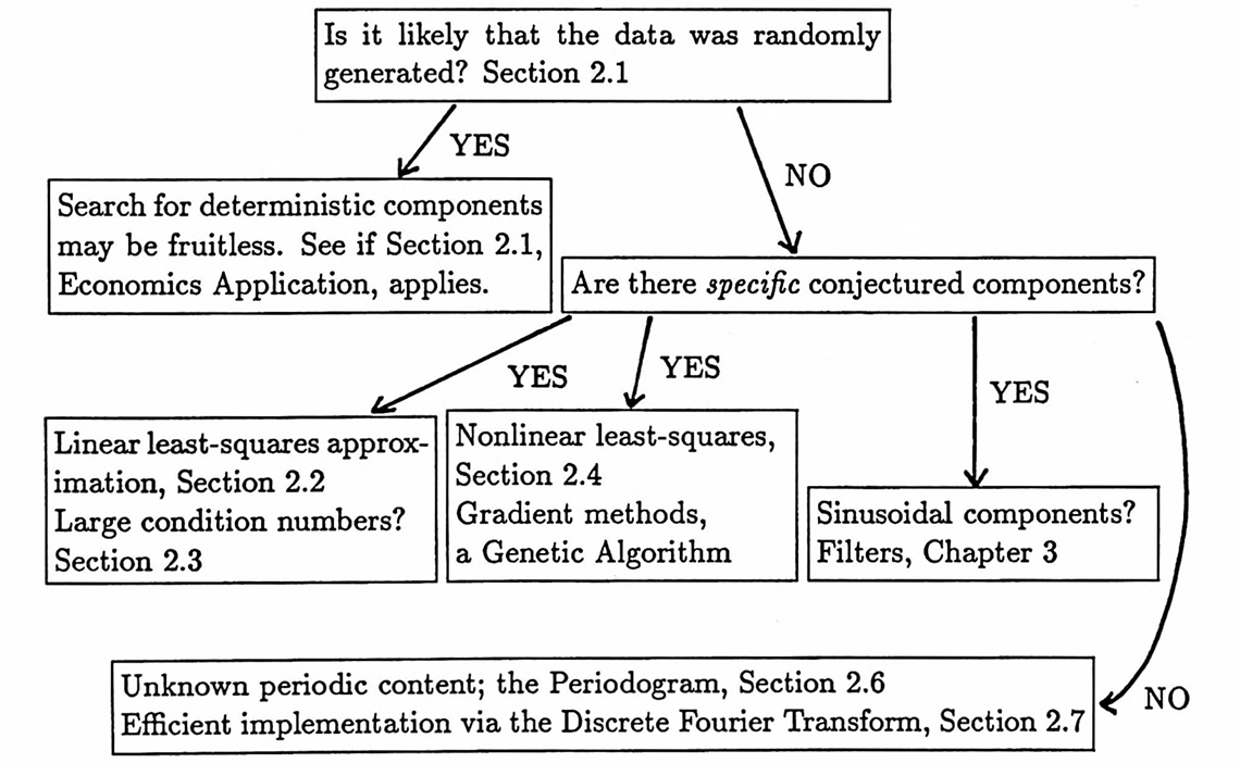
3.4 Identifying Hidden Periodicities: Approach and Examples
The following flowchart, which also appears in the preliminary pages of this dissertation, suggests a strategy for analyzing a data set. This section contains examples illustrating the application of the procedure presented here.
Data sets sometimes have missing values. Such entries can be represented via the MATLAB matrix entry NaN (‘Not a Number’). However, any arithmetic calculation using a NaN yields NaN as the final result. Therefore, NaN entries must be removed or replaced by interpolated values before any processing can be done on a data set.
The following MATLAB function can be used to remove ordered pairs of the form (t,NaN) from a data set.
The MATLAB function delnan (‘delete not a number’), with source code given below, removes the NaN values from a data set D . To use the function, type:
Dr = delnan(D);
The input is a matrix D ; the first column of D contains the time values of data points, and the second column contains the corresponding data values. Thus, each row of D is a data point.
The output is a matrix Dr that is identical to D , except that rows of the form (t,NaN) have been removed.
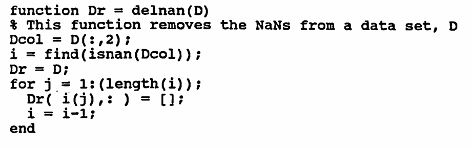
The use of delnan is illustrated in the next example.
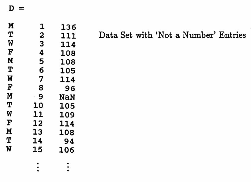
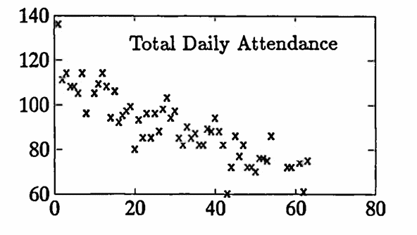
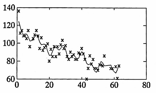
The data set graphed below gives the total daily attendance in three undergraduate classes taught by the author during the Fall 1993 semester at Idaho State University. Two sections of Math 111 (Algebra) and one section of Math 120 (Calculus for the Life and Social Sciences) were taught.
Each class met four days per week: Monday, Tuesday, Wednesday, and Friday. The data values recorded as NaN represent days when classes did not meet.
This data set is stored in a MATLAB matrix D . The symbols M, T, W, F (the days of the week that classes met) are shown below only for the reader's information, and are not included in the matrix D .
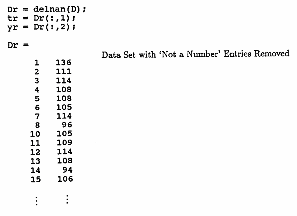
Dr
tr
yr
First, the MATLAB function delnan is used to remove the NAN entries from D . The resulting matrix is named Dr (‘r’ for ‘removed’). The first column of Dr is named tr , and the second column is named yr .
Observe that row $\,9\,$ of D , which contained a NaN entry, has been removed.
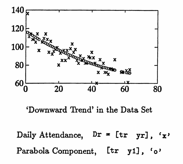
The ‘downward trend’ in the data is quite striking, so linear least-squares approximation techniques are used first to fit the matrix Dr = [tr yr] with a parabola. The parabola component obtained is named y1 :
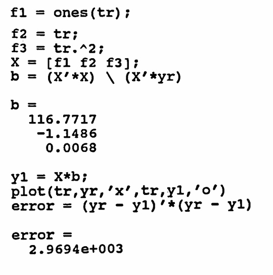
f1 = ones(size(tr));
The parabola component y1 is subtracted from yr ; the difference is named yrem . The list yrem is tested for random behavior using the Turning Point Test:
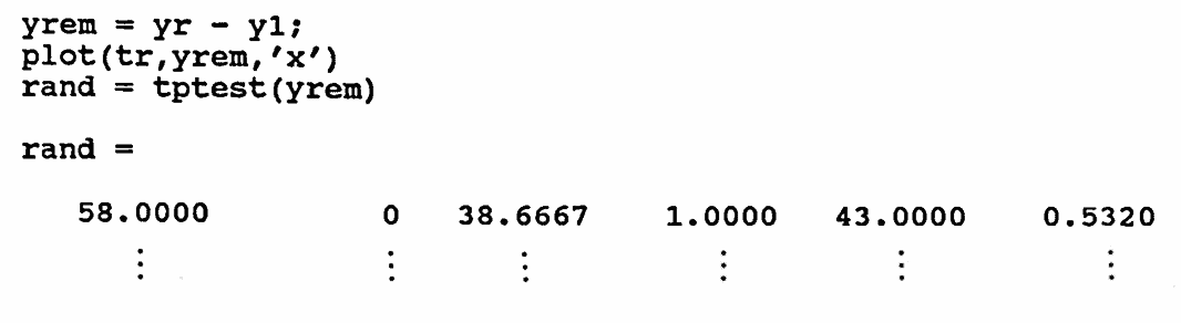
The information given in rand shows that if yrem were generated by random means alone, then one would expect to see about $\,38.7\,$ turning points. There are actually $\,43\,$ turning points in yrem . The probability that $\,43\,$ or more turning points would occur, should the data be truly random, is about $\,53.2\%\,.$ A decision is made to search for sinusoidal components.
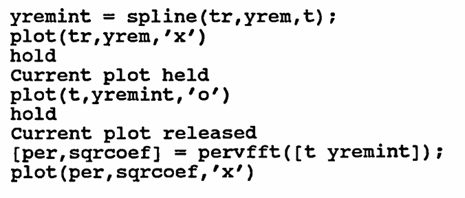
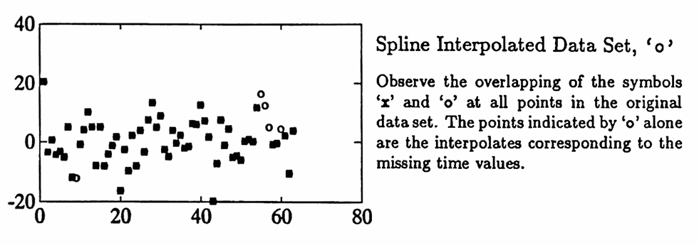
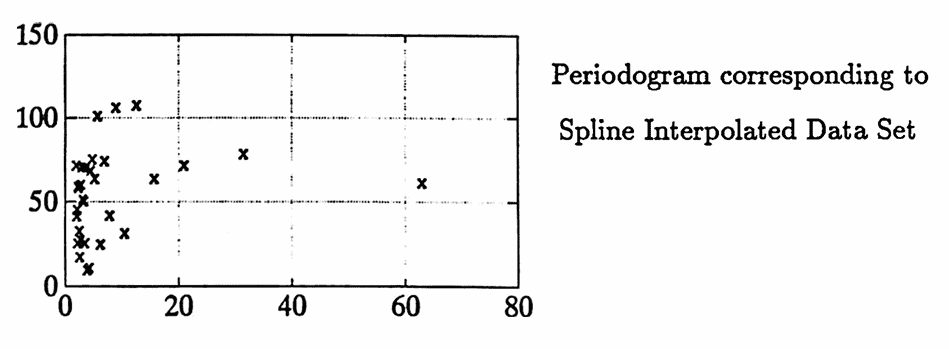
There are no obvious sinusoidal components in yrem . The periodogram is obtained as an initial data analysis tool. Since a uniform time list is required to find the periodogram, spline interpolation is used to interpolate the data set [tr yrem] . Then, the periodogram of the interpolated data set is computed. Both the interpolated data set and its periodogram are graphed below.
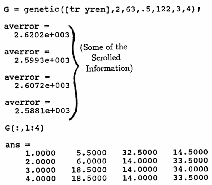
A genetic algorithm is used to search for sinusoidal components in the range of periods from $\,2\,$ to $\,63\,.$
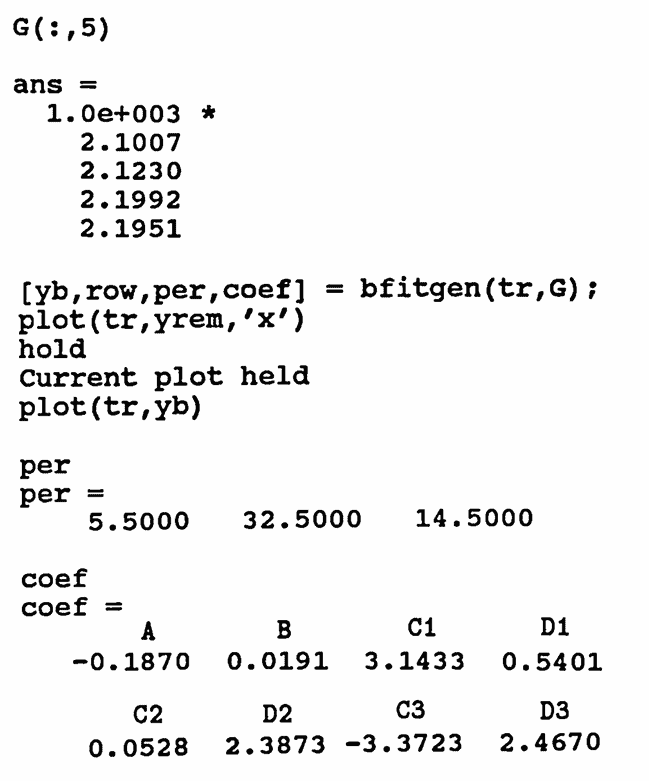
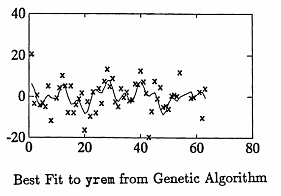
A good fit is found using sinusoids with periods $\,14.5\,,$ $\,5.5\,,$ and $\,32.5\,.$ Selected commands used in the fitting process are shown below. Also, the graph of the best fit is given.
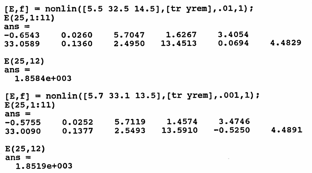
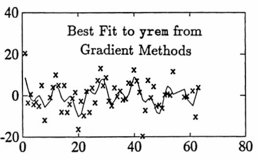
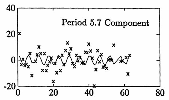
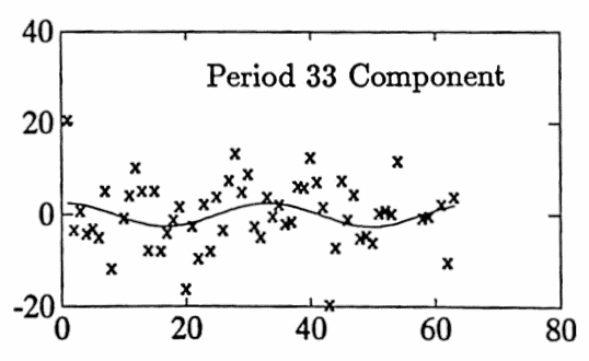
Gradient methods are used to improve the fit. After two iterations, a ‘best’ fit is found, with approximate periods $\,5.7\,,$ $\,33.0\,,$ and $\,13.6\,.$ Selected commands used are shown below. The graph of the best fit is given, as well as the graphs of each of the three sinusoidal components.
These three components have a reasonable interpretation: period $\,5.7\,$ is slightly longer than a weekly component; period $\,13.6\,$ represents the time between exams in the course (this component peaks at the exam dates); and period $\,34.5\,$ is approximately half the semester (this component peaks at mid-semester).
The sum of the parabola component and the three sinusoidal components are shown with the original data:
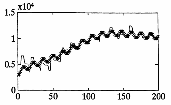
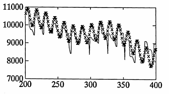
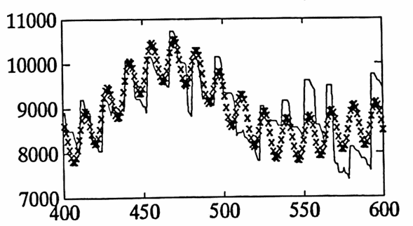
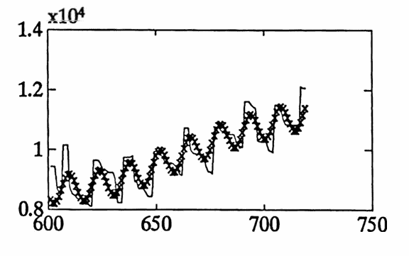
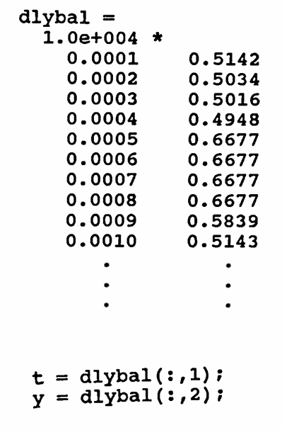
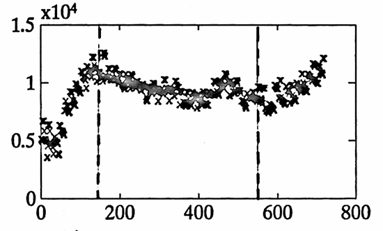
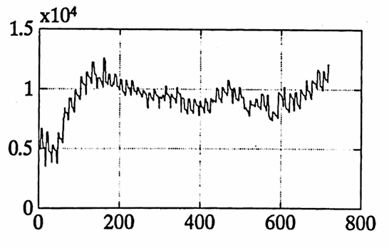
The data set graphed below gives the daily balance in a checking account from $\,1/14/92\,$ to $\,12/31/93\,.$ Both a ‘point’ graph and a ‘line’ graph of the data are shown.
There are several trends in the data, due to different types of employment for one contributor to the account:
- From $\,1/14/92\,$ to $\,5/22/92\,,$ one contributor was employed full-time, on a $9$-month pay schedule.
- From $\,7/13/92\,$ to $\,7/30/93\,,$ the same contributor was employed half-time, on a $12$-month pay schedule.
- From $\,8/27/93\,$ to $\,12/31/93\,,$ the same contributor was employed full-time, on a $12$-month pay schedule.
These three periods are roughly delineated in the first graph below, by the dashed vertical lines.
The first column of dlybal is named t , and the second column is named y .
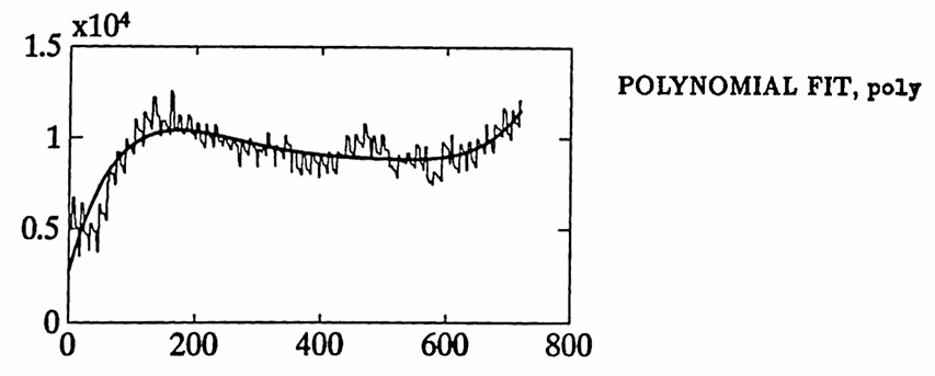
A least-squares polynomial fit is used to account for the different employment types. After some experimentation, the analyst decides that the best fit to account for these trends is obtained by using a fifth order polynomial. The polynomial fit is named poly , and the difference between y and poly is named diff1 .
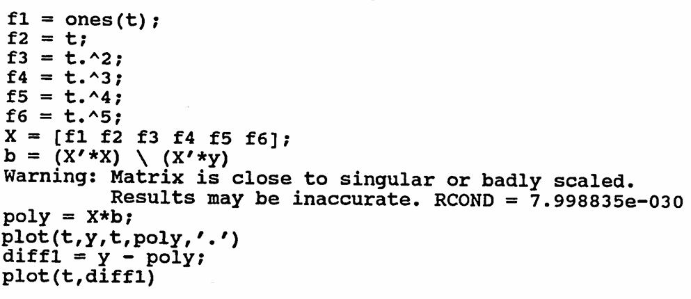
f1 = ones(size(t));
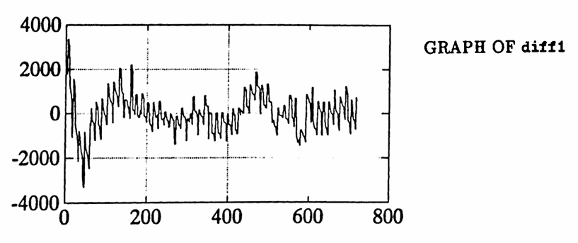
As a preliminary analysis tool, the periodogram of diff1 is found. Inspection of the matrix [per sqrcoef] shows that the three highest peaks occur at periods $\,14,$ $\,120,$ and $\,180.$
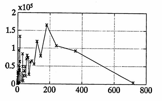
As another preliminary analysis tool, a genetic algorithm is applied to diff1 . Due to memory constraints on the analyst’s computer, only a very limited application is made. However, a component close to $\,180\,$ does emerge in one of the ‘best-fit’ strings. Also, inspection of each population shows that period $\,365\,$ appears in many ‘high-fit’ strings.
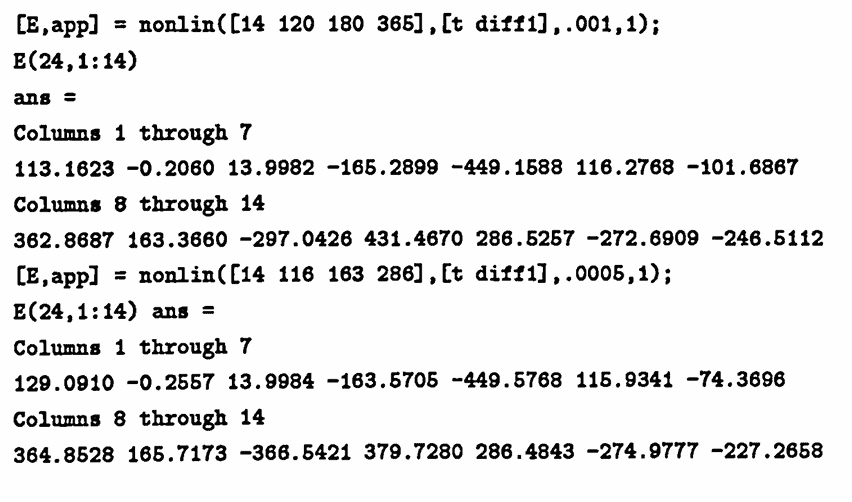
Based on these initial analyses, gradient methods are used to fit diff1 with sinusoids of periods $\,14,$ $\,120,$ $\,180,$ and $\,365\,.$
After two iterations of the MATLAB function nonlin , a best fit to diff1 is obtained using periods of approximately $\,14,$ $\,116,$ $\,166,$ and $\,286.$ These are roughly $2$-week, $\,\frac 13$-year, $\,\frac 12$-year, and $\,\frac 34$-year components.
By adding poly to the best fit obtained from diff1 , the total approximation to the data is found. This approximation is graphed below using an ‘x’, superimposed over the actual data set (as a line graph). The graph is broken into $\,4\,$ smaller pieces for easier readability.