 Discussion: Graphing Polynomials with Technology
This section is optional. There are no web exercises for this section.
The prior section, Multiplicity of Zeroes and Graphical Consequences, mentioned that it's often difficult (or impossible) to get a single to-scale graph of a polynomial that clearly shows the interesting behavior near all the zeroes at the same time.
Also, some graphing software can exhibit puzzling behavior when graphing polynomials, which can leave you scratching your head!
The example of the previous section is re-visited, to more deeply explore the issues that can arise.
Example: Multiplicity of Zeroes
Let $\ P(x) = (x+2)x^5(x-1)^3(x-4)^2\,.$ Then:
| $-2\,$ is a simple zero: | from the factor $(x+2) = (x - (-2))$ |
| $0\,$ is a zero of multiplicity $\,5\,$: | from the factor $x^5 = (x - 0)^5$ |
| $1\,$ is a zero of multiplicity $\,3\,$: | from the factor $(x-1)^3$ |
| $4\,$ is a zero of multiplicity $\,2\,$: | from the factor $(x - 4)^2$ |
Study the graphs of the polynomial $\,P\,$ below, paying close attention to the scales on the $y$-axis. The scales on the $x$-axis are identical in all six graphs.
(A)
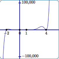
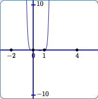
In (A):
- The scale on the $y$-axis is from $\,-100{,}000\,$ to $\,100{,}000\,.$
- It's fairly easy to see that $\,-2\,$ and $\,4\,$ are zeroes.
- The outputs close to $\,0\,$ and $\,1\,$ are so small compared to $\,100{,}000\,$ that it is impossible to see that $\,0\,$ and $\,1\,$ are also zeroes.
- The small bump before $\,x = 4\,$ looks like it peaks at about one-tenth of the distance from $\,0\,$ to $\,100{,}000\,.$
(B)
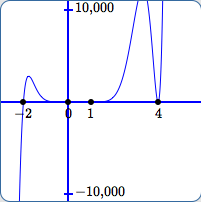
In (B):
- The scale on the $y$-axis is from $\,-10{,}000\,$ to $\,10{,}000\,.$
- It's very easy in this view to see that $\,-2\,$ and $\,4\,$ are zeroes.
- The outputs close to $\,0\,$ and $\,1\,$ are so small compared to $\,10{,}000\,$ that it is still impossible to see that $\,0\,$ and $\,1\,$ are zeroes.
- Notice that we've ‘lost’ the peak of the bump before $\,x = 4\,$ since the $y$-values there are greater than $\,10{,}000\,.$
(C)
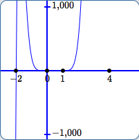
In (C):
- The scale on the $y$-axis is from $\,-1{,}000\,$ to $\,1{,}000\,.$
- It's very easy in this view to see that $\,-2\,$ is a zero.
- There does not appear to be any graph near $\,x = 4\,,$ so in this view it is impossible to tell that $\,4\,$ is a zero, or even that numbers near $\,4\,$ are in the domain of the function (more on this below).
- The outputs close to $\,0\,$ and $\,1\,$ are still so small compared to $\,1{,}000\,$ that it is impossible to see that $\,0\,$ and $\,1\,$ are zeroes.
- In this view, one might (falsely) be led to believe that the the outputs keep getting bigger and bigger, ad infinitum, for all $\,x\,$ to the right of $\,1\,.$
(D)
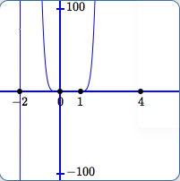
In (D):
- The scale on the $y$-axis is from $\,-100\,$ to $\,100\,.$
- This graph is similar to (C), except that the points move out of this view earlier.
- All comments except the first in (C) still apply.
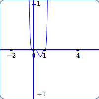
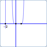
(E)
In (E):
- The scale on the $y$-axis is from $\,-10\,$ to $\,10\,.$
- It's beginning to seem plausible that $\,0\,$ and $\,1\,$ are zeroes.
- More of the graph has been lost. Now, there does not appear to be any graph near $\,x = 4\,$ or $\,x = -2\,.$
- The outputs close to $\,0\,$ and $\,1\,$ are still so small compared to $\,10\,$ that it is difficult to see the behavior there.
- In this view, one might (falsely) be led to believe that the the outputs keep getting bigger and bigger, ad infinitum, for all $\,x\,$ to the right of $\,1\,,$ and for all $\,x\,$ to the left of $\,0\,.$
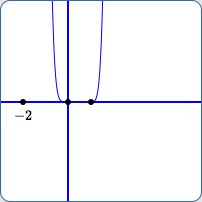
(F)
In (F):
- The scale on the $y$-axis is from $\,-1\,$ to $\,1\,.$
- We are finally beginning to see the actual behavior close to $\,0\,$ and $\,1\,.$
- Still, one might (falsely) be led to believe that the the outputs keep getting bigger and bigger, ad infinitum, for all $\,x\,$ to the right of $\,1\,$ and to the left of $\,0\,.$
Why Does Part of the Graph Disappear Between (B) and (C), and Another Part Between (D) and (E)?
Roughly, the problem is this: near $\,4\,$ and $\,-2\,,$ the function is getting big way too fast.
Here are some details. Note that JSXGraph is the JavaScript-based software that I use for graphing.
The JSXGraph display boxes used for graphs (A) through (F) are $\,200\,$ pixels by $\,200\,$ pixels. (You can view the HTML source for this page, and search for (say) ‘box10’.)
Horizontally, each graph must display from $\,-3\,$ (the left-hand edge) to $\,6\,$ (the right-hand edge) in $\,200\,$ pixels.
Thus, there are $$\frac{6 - (-3)}{200} = \frac{9}{200} = 0.045$$ units per pixel, horizontally.
Here are some function values (and the corresponding points) near $\,4\,$:
| $P(4 - 6*0.045) = 6136.41$ | $(3.730,6136.41)$ |
| $P(4 - 5*0.045) = 4789.51$ | $(3.775,4789.51)$ |
| $P(4 - 4*0.045) = 3439.79$ | $(3.820,3439.79)$ |
| $P(4 - 3*0.045) = 2167.99$ | $(3.865,2167.99)$ |
| $P(4 - 2*0.045) = 1078.24$ | $(3.910,1078.24)$ |
| $P(4 - 1*0.045) = 301.10$ | $(3.955,301.10)$ |
| $P(4) = 0$ | $(4,0)$ |
| $P(4 + 1*0.045) = 374.26$ | $(4.045,374.26)$ |
| $P(4 + 2*0.045) = 1665.69$ | $(4.090,1665.69)$ |
| $P(4 + 3*0.045) = 4164.59$ | $(4.135,4164.59)$ |
| $P(4 + 4*0.045) = 8216.68$ | $(4.18,8216.68)$ |
| $P(4 + 5*0.045) = 14,230.70$ | $(4.23,14,230.70)$ |
| $P(4 + 6*0.045) = 22,687.00$ | $(4.27,22,687.00)$ |
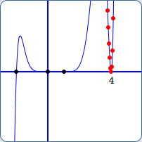
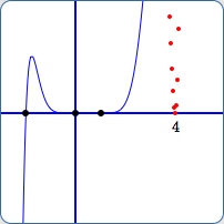
From experimentation, it was determined that JSXGraph shows the graph near $\,4\,$ when the vertical scale is $\,[-5543,5543]\,,$ but does not show the graph near $\,4\,$ when the vertical scale is $\,[-5542,5542]\,.$ See (G) and (H) below.
All nine points above with $y$-values less than $\,5543\,$ are plotted in red in both (G) and (H).
Why does JSXGraph ‘connect the dots’ in (G), but not in (H)? In other words, why is the graph near $\,x = 4\,$ shown in (G), but not in (H)?
Evidently JSXGraph uses some method to decide when it is possible to display a meaningful graph. Perhaps the interested reader can study the code to see precisely what is happening here!
Viewing window for $y$:
$[-5543,5543]$
Viewing window for $y$:
$[-5542,5542]$
Viewing window for $y$:
$[-27,27]$
Viewing window for $y$:
$[-26,26]$
The last two viewing windows above illustrate the graph ‘starting’ to disappear near $\,x = -2\,$ (I), and then disappearing completely (J).
In both cases, points $\,(-2.045,-1660.48)\,$ and $\,(-1.955,1175.93)\,$ are far, far below and above the current viewing windows.
The point of this optional section is to illustrate how difficult it can be to get a meaningful viewing window for a graph, and also to illustrate some of the misleading things that can occur when you use technology to produce graphs.